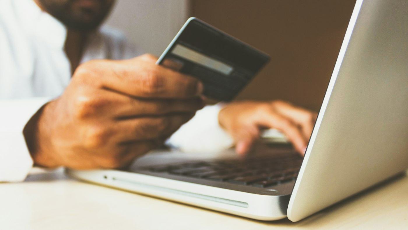
In short: checkout abandonment is when a shopper starts paying and then leaves. Most of the reasons are fixable: surprise costs, forced accounts, long forms, missing payment methods, slow mobile pages and a lack of trust. Fix those in order, measure each step, and follow up kindly with people who still leave.
Getting someone to add a product to their cart is hard work. Losing them at the last step is painful, and it happens far more than most store owners realise. Baymard Institute's running average of 50 studies puts the documented online cart abandonment rate at 70.22%. Some of that is people who were only browsing, and you will never win them all. But a large share leave because of problems in the checkout itself, and those are yours to fix.
This guide explains why checkout abandonment happens, the fixes that matter most, and how to work out where your own store is losing people.
Why checkout abandonment happens
Baymard asked US online shoppers who had abandoned an order why they left. Leaving aside the people who were just browsing, the most common reasons were:
- Extra costs too high (shipping, tax, fees): 40%
- Delivery was too slow: 20%
- Did not trust the site with card details: 19%
- The site wanted them to create an account: 18%
- Too long or complicated checkout: 17%
- The website had errors or crashed: 17%
- Returns policy was not good enough: 13%
- Could not see or calculate the total cost up front: 12%
- Card was declined: 10%
- Not enough payment methods: 9%
Source: Baymard Institute, cart abandonment rate statistics. People could give more than one reason.
Two things stand out. First, almost every reason on that list is something the store controls. Second, the biggest one is not about design at all: it is about price surprises. Baymard also estimates that the average large e-commerce site could gain a 35.26% increase in conversion rate through better checkout design alone. That is an estimate from their testing, not a promise, but it shows how much is usually left on the table.
Seven fixes that reduce checkout abandonment
1. Show the full price early
Unexpected shipping, tax or fees are the top reason people leave. Show delivery costs on the product page or in the cart, not at the final step. If you offer free delivery above a certain order value, say so clearly in the cart along with how much more the shopper needs to add. Show the delivery date or window too, because slow delivery is the second biggest reason.
2. Let people check out as a guest
Forcing someone to create an account before they pay is a classic way to lose them. Make guest checkout the obvious, default option. Offer to create an account on the confirmation page instead, where you already have their email and they only need to choose a password. Returning customers can still sign in, but nobody should be blocked.
3. Ask for less
Every extra field is one more reason to quit. In Baymard's checkout benchmark, the average checkout had 11.3 form fields in 2024, while most sites need only 8. Practical ways to cut down:
- Use one "Full name" field instead of separate first and last names where your courier allows it.
- Hide "Address line 2" and the coupon field behind a small link.
- Default the billing address to the delivery address.
- Look up the city and state from the postcode or PIN code.
- Add the right autocomplete attributes so browsers can fill names, addresses and cards in one tap.
- Use the correct keyboard on phones: numbers for phone and PIN code, email keyboard for email.
4. Offer the payment methods people actually use
If a customer cannot pay the way they prefer, many will simply not pay. Which methods matter depends on where your buyers are:
- India: UPI is the everyday way to pay, so it should be one tap away, with UPI apps opening directly on mobile and a QR code on desktop. NPCI publishes monthly UPI figures if you want to see the scale. Add cards, net banking and wallets, and consider cash on delivery for new customers, with a clear policy.
- Elsewhere: cards plus Apple Pay and Google Pay cover most people; some markets also expect PayPal or buy-now-pay-later.
Show payment logos early, in the cart, so nobody gets to the last step and discovers their method is missing.
5. Make it fast and easy on mobile
Many shoppers check out on a phone, often on a patchy connection. Use a single column, large tap targets, a sticky "Pay" button and no pop-ups. Speed matters too: Google's Core Web Vitals suggest the main content should load within 2.5 seconds and the page should respond to a tap within 200 milliseconds. We cover the commercial side of this in how website speed affects sales.
6. Show trust where the doubt happens
Nearly one in five people in Baymard's survey left because they did not trust the site with their card. Reassure them near the pay button, not only in the footer:
- A short line saying payment is handled securely by your payment provider.
- A one-sentence summary of your returns policy, with a link.
- Real reviews or a rating near the order summary.
- A visible phone number, email or WhatsApp link for questions.
Keep the checkout looking like the rest of your store. A sudden change of design or domain makes people nervous.
7. Handle errors gracefully
Crashes, card declines and confusing error messages lose real buyers who wanted to pay. Keep everything the shopper typed when something fails. Explain errors in plain words next to the field ("This PIN code looks too short"), not in a red banner at the top. If a payment fails, offer another method straight away rather than sending them back to the start.
Win back shoppers who still leave
Even a great checkout loses some people. A short, friendly reminder by email, and by WhatsApp or SMS where the customer has agreed to it, can bring many of them back. Good reminders:
- Arrive within a few hours, while the shopper still remembers.
- Show the product they left, with a one-tap link back to a saved cart.
- Answer a likely doubt (delivery time, returns, sizing) rather than just saying "you forgot something".
- Use a discount sparingly, if at all, so customers do not learn to wait for one.
This works best when your email automation is connected to the store, so reminders stop as soon as the order is placed.
How to find where your store loses people
Do not guess. Set up step-by-step tracking so you can see how many people reach each stage: cart, details, delivery, payment and confirmation. The biggest drop is where to start. If you are not sure your numbers are right, proper analytics and tracking comes first.
Then add the human side:
- Buy something from your own store on a cheap phone, on mobile data.
- Watch two or three real people try it and stay silent while they do.
- Read support messages and chat logs for questions asked during checkout.
- Check failed payments in your payment provider's dashboard.
Change one thing at a time and compare results over a few weeks, so you know what actually helped. This test-and-learn approach is the core of good conversion rate optimisation.
Checkout abandonment checklist
- Delivery cost and delivery date are visible before checkout.
- Guest checkout is the default; account creation is offered after the order.
- The form has no fields you do not need to deliver the order.
- Autocomplete, postcode lookup and the right phone keyboards are in place.
- Local payment methods (UPI in India; wallets elsewhere) are offered and shown early.
- The checkout loads quickly and works one-handed on a phone.
- Trust signals and the returns policy sit near the pay button.
- Errors keep the shopper's data and explain the fix in plain words.
- Abandoned-cart reminders go out within hours and stop once someone buys.
- Each checkout step is tracked, and changes are tested one at a time.
Where to start
If you only do three things this month, show the full price early, allow guest checkout and add the payment methods your customers expect. These tackle the biggest reasons in the research and rarely need a full rebuild. If your store needs deeper work, our e-commerce development team at Rachyet builds and fixes checkouts for stores in India and worldwide. Get in touch and we will review your checkout with you.